

CSS Units Explained: EM Vs REM
With responsive designs everywhere, many of us use em and rem in our designs. Have you ever wondered how they differ and fit our design needs?

In CSS, the numeric value <length> represents the size of the elements. 💻💻
This CSS data type, <length>, represents the distance value. Many CSS properties such as width, height, margin, padding, border-width, font-size, text-shadow, box-shadow etc., uses <length>
CSS gives us different units to express <length>.
They fall into two categories: Absolute Units & Relative Units.
Absolute units are physical measurements and will always be the same size. Examples are px, pt etc.
Relative Units are dynamic and depend on other (mostly parent) elements' <length>. Examples of these are em, rem, vh, vw etc. With responsive designs everywhere, they are used to create perfectly scalable layouts.
Many of us already use em and rem in our designs. Have you ever wondered how they differ and whether they fit our design needs? 🤔🤔
We will examine the differences between em and rem in this blog post and explore how they impact our designs.
Understanding CSS Unit em
The unit em is always relative to the font-size of the parent element.
Let us take an example 👇🏻👇🏻
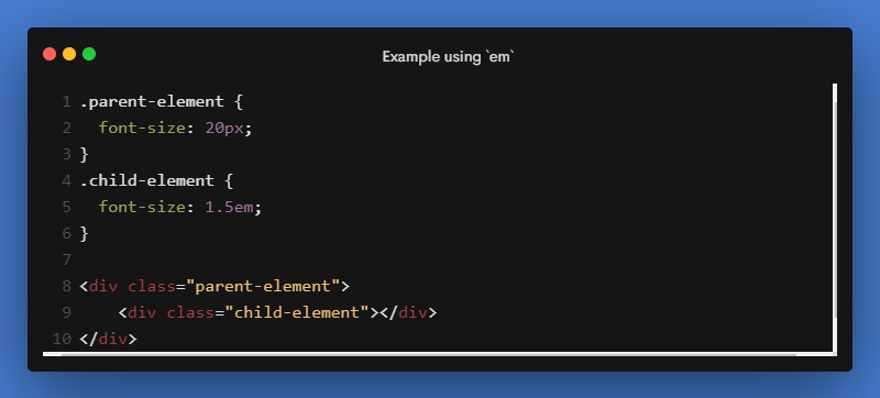
In the above example, the font-size of the .child-element is 30px
For the .child-element, the font-size is calculated based on its parent, i.e, .parent-element font-size 🤔🤔
Child element font-size calculation:
parent-element font-size = 20px
Hence in the child element,
1em = 20px
1.5em = 20 * 1.5 = 30px
Hence, the child element's font-size is 30px.
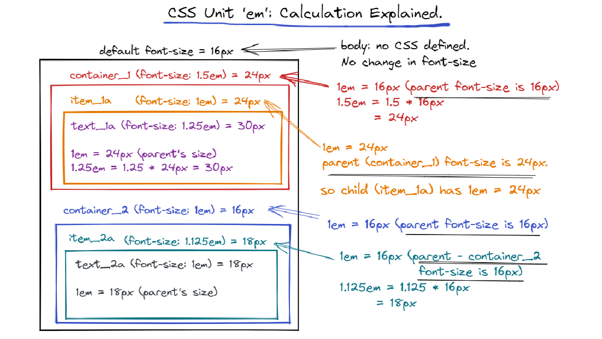
If the parent element's font-size is not specified, it will be looked higher up in the DOM tree. If no font-size is specified until the root element, <html>, then the browser's default of 16px is used.
Therefore, em's are compounding from one level to the other.
Let us take a quick look at the next example.
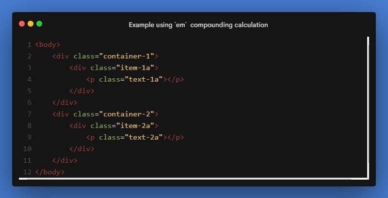
👇🏻👇🏻 For the HTML above, here is a picture of em calculated down the DOM.
A further interesting fact about em is that when used for properties other than font-size, such as padding, margin, etc., it is relative to the element's own font-size.
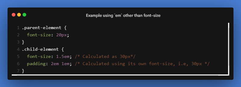
For the above example, the padding is calculated based on its own font-size: 30px.
As a result, the top and bottom padding will be 60px (2em * 30px) and the right and left padding will be 30px (1em = 30px).
A live example of how em works. 🎯🎯
This compounding nature of em can lead to unintended consequences in our designs. rem solves this issue.
Understanding CSS Unit rem
For the sole purpose of solving the compounding problem of em, the rem unit is introduced. rem stands for root element's em.
rem always refers to the root element's (in our case, the HTML element) font size no matter where it is applied. It stays consistent throughout the document and to all the properties.
Here is how rem is calculated down the DOM for the same example as em. 👇🏻👇🏻
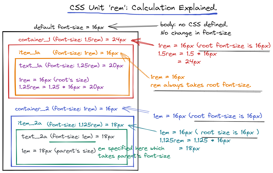
Using rem units allows us to avoid the compounding effect of em units.
With rem, it is always based on the font-size of the root element, so there are no surprises.
Also, with other values like margin, padding etc., rem is consistently based on the font-size of the root element
Live example of rem 🎯🎯
Conclusion: EM or REM?
Choosing between em or rem always depends on personal preferences. There is no such thing as a better option between them.
If you want a consistent design with no surprises, use rem. If you want to achieve something that is influenced by the parent element, then use em. But extensive testing for different devices and orientations should be done when using em.
My Personal preference is rem over em.
Finally, here is a little comparison between em and rem. 👇🏻
If I have missed something, let me know in the comments.